
Mode
An inclusive fashion eCommerce. A lifestyle for fashionistas.
MY ROLE
UX Design
UI Design
Prototyping
Social Commerce
Newsletter Design
TOOLS
Typeform
Hotjar
Axure
Figma
Pencil + Paper
challenge.
- Assist users with combining clothing items
- Keep fashionistas updated about the latest trends
- Clear product description
solution.
- GET THE LOOK (select items on the product page to shop)
- TRENDY category dedicated to the latest trends
- SIZE GUIDE with detailed description (measures, not size labels)
understanding our users.
user research
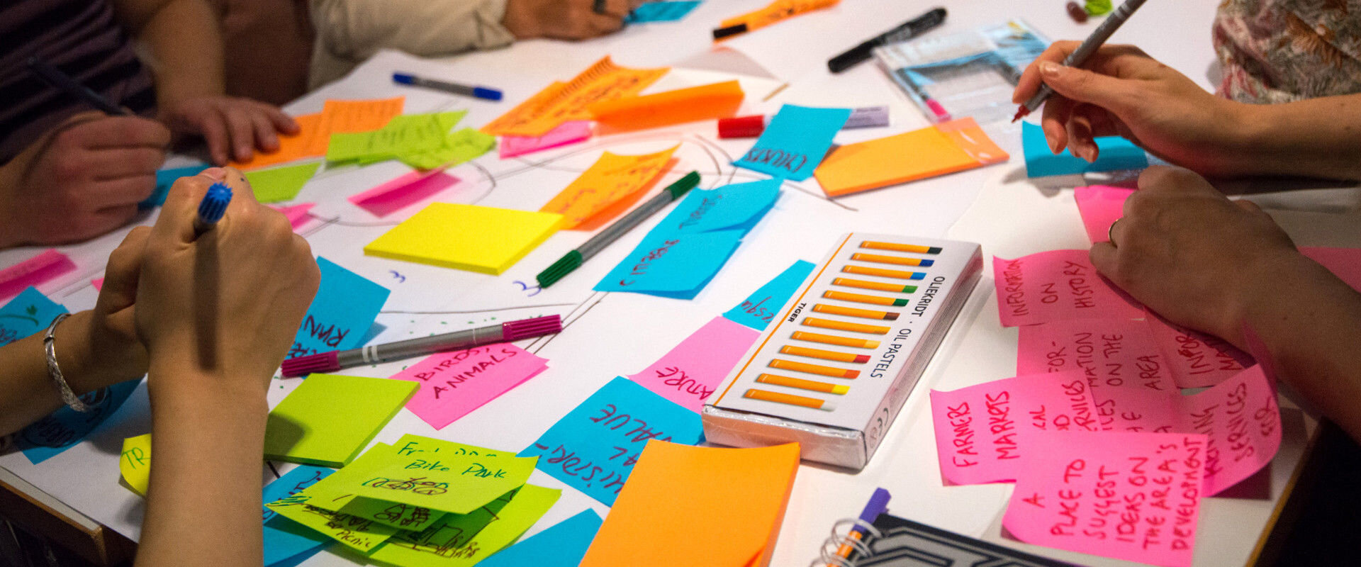
Method 1: User Interview + Survey
As a step for the user research, a group of users was invited to introduce
themselves and answer a brief survey
Research Goals
- Discover user profile (age, behavior, spending habits, needs, pain points)
- Analyze their familiarity with fashion online shopping
Method 2: User Observation
Users were asked to perform a few tasks on competitors eCommerce and describe the positive and negative aspects of their experience
Research Goals
- Understand the pros and cons of our competitors’ usability
- Observe and understand the train of thought of our users as they try to complete tasks
- Highlight the positives and negatives of their experience
user research insights

64% need help putting
together clothing items

56% said costumer reviews
make their decisions faster

92% base their decision on
clear product description

83% would purchase
via social commerce
clear product info x cluttered navigation.
Apart from the numerical insights mentioned above, it was also possible to obtain qualitative insights thanks to some remarks made by our users.
These remarks took form in observations, comments, thoughts and feelings and helped to tell a story about their experience. Later they were divided into behavioral (examines how people use your product) and attitudinal methods (what people think of your product)
designing for online & offline shoppers.
who are we designing this eCommerce for?
Having gathered enough info, I carefully analyzed the insights and was able to move onto the next step: creating user personas.
It became more clear who the users of the upcoming eCommerce were, their habits, goals and pain points and later they were separated into two profiles: the online and the in-store shopper
user persona
online Alicia
Alicia is an expert fashion online shopper.
She is an active social media user and follows fashion bloggers and brands on Instagram to stay updated on the latest trends.
She also has a fashion board on Pinterest where she pins her favorite items for future inspiration
in-store Amanda
Amanda likes to try her clothes on and feel up fabrics.
Having an allergy to it is really important for her to have detailed info about the fabrics used.
She also wants to have a more polished fashion style
card sorting
Being a fashion brand exclusive for women would definitely reduce the information architecture of the eCommerce, yet it was still important to learn how the prospect users would better understand and navigate throughout the eCommerce. For that matter, I opted for a card sorting dynamic and asked the same group of users to organize the topics into categories that would later help me structure the main navigation
site map
Having gathered the info from the card sorting dynamic and the user observation earlier, I analyzed both results in order to understand what works and what doesn’t from the users’ perspective and started to organize Mode’s webshop navigation
sketching solutions.
hick’s law
An interesting principle I felt was appropriate for this step of the process is the UX principle known as Hick’s Law
“The time it takes to make a decision increases with the number and complexity of choices”
My principle while sketching the screens was to avoid overwhelming the user with many options of actions to take and focus the user flow on the main action he/she is trying to take at that moment

Search screen for Zara (minimal and objective)

Search screen for Amaro (cluttered and confusing)
moodboard
My creative process as an UI Designer always involves taking some time to do some research on the visual elements that could be applied based on the UX research then create a moodboard to help better visualize the concept. Having a clear understanding of the data gathered during the UX research I put together elements that I considered cohesive for this project
wireframes
how UI design helped solving our UX problems.
UI elements


social commerce
final considerations.
As my first UX study case, this project gave me a practical understanding of how to center the design process around the main character: the user.
By having a direct communication with our users it was possible to shape and deliver an product that not only understood, but also solved their needs while shopping online.
The communication of the eCommerce with 2 different types of users, online and offline shoppers was the north to be followed in order for the research to be validated.
Working closely with the users was an estimable experience that I will defend on my next projects.
I now have a better understanding of the design process, its limitations, challenges and successes.


